Why Things?
I’ve tried a number of list management apps over the last ten years, but I always come back to Cultured Code’s Things app. Things was the first task-list app I’d ever tried back in 2008 and while it has the simplicity and organization that I need, it’s not without fault.
What I Love
Below are a quick-hit list of things I really love about Things. Although, as I’ve found out while writing this all down, I have a love for the app that I cannot fully explain. Suffice it to say that I may just be bias or partial to Things because it works for me, and maybe it won’t work for you.
Keyboard shortcuts
The shortcuts for Things have always been a huge draw for me.
- Want to create a new task from anywhere? Press ⌘-Shift-Space
- Want to set the current task as due today? Press ⌘-T
- Want to reschedule the current task to tomorrow? Press ⌘-R, then press Return right away.
- Want to reschedule the current task to five days from now? Press ⌘-R, 5, then press Return.
- Press ⌘-. to mark the current task as completed.
- Press ⌥-Del to mark the current task as canceled.
Other apps I’ve tried also have decent keyboard shortcuts, but I’ve never found them to be quite as nice as Things.
Inbox, Today, Scheduled, Next
Your tasks can be put in a variety of places, but for optimal Getting-Things-Done (GTD), you’ll want to follow the guide.
- New tasks without a project go in your “Inbox”. Get it out of your head, and recorded here for later filing.
- Tasks to complete today go in the “Today” area
- See all tasks you have given due-dates in the “Scheduled” area.
- Set up your next few days by putting tasks in your “Next” area.
At the beginning of each day I attempt to go through my Inbox and my Next areas to file tasks, and determine which tasks I want to start today or which tasks I need to schedule for a future date. I may also push tasks into projects I’ve setup and give the tasks some tags so they are grouped logically.
This system has worked well for me, and I still tinker with how many tasks I allow in my “Today” area, and which tasks I defer (reschedule) into “Next” or with a due date of the following day. I feel that this keeps me sane, and on task, coupled with my extensive Evernote rituals.
This organization of tasks is not new, or unique to Things, but it is unique to most of the apps I’ve tried that typically sort by “Today” and “Projects” only. You may get lucky and get a “Scheduled” or week-view.
Rescheduling (on desktop)
I love the “re-schedule” flow on the Mac app. Hitting ⌘-R and setting a new due date for an task is wonderfully fast. This is perfect for tasks I didn’t complete today, but want to get to first thing tomorrow. While this works great on the desktop app, the process is not nearly as smooth on the mobile app. See my wish list at the end for a more detailed breakdown of this.
Other apps I’ve tried
Like most things that I love, I’ve had to try a number of other competitors/rivals out there to figure out which app sits at the top. I do this with fitness trackers (potentially a future blog post), note-taking apps, and IDEs/code editors. I’ll highlight a little about each app attempting to target what I liked, and didn’t like, about each.
Microsoft OneNote
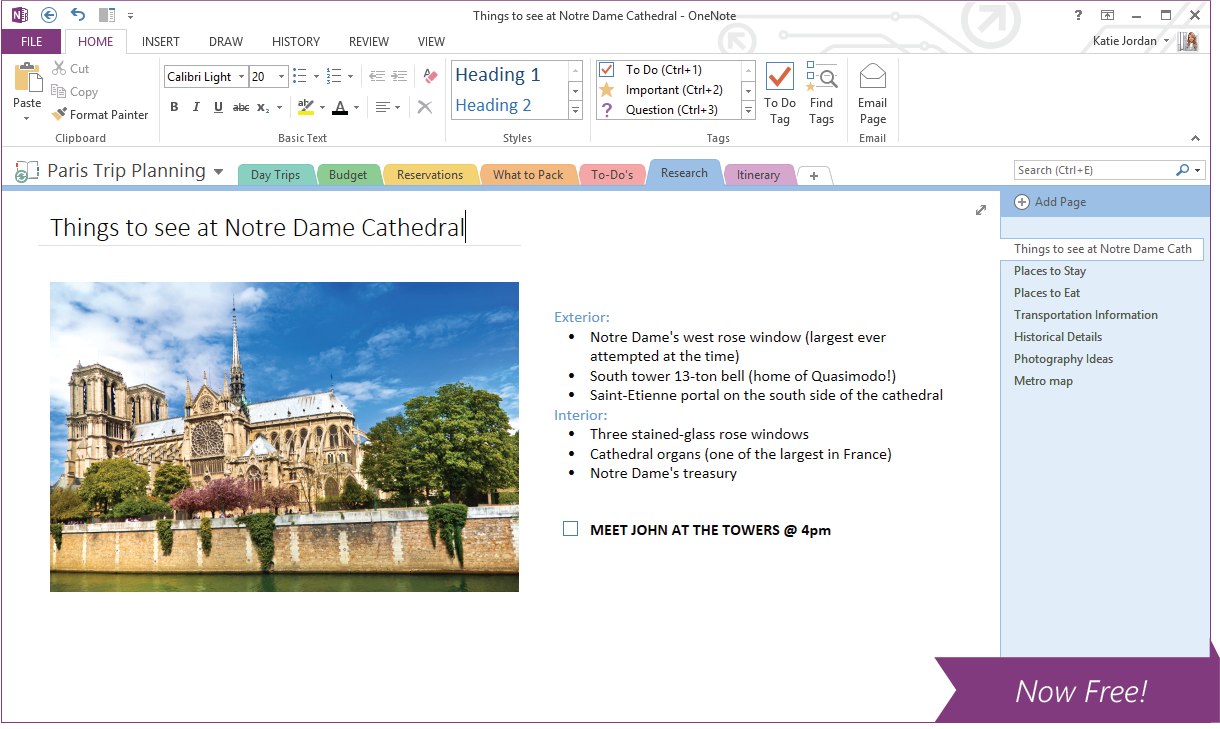
This was the very first to do list app I’d tried back in 2005. I created a single note for my week, and at the very top of the note was the master-list of tasks I wanted to complete that week–I’d add, remove and complete tasks constantly throughout the week. Below the list was all my notes from the week, broken up by large headings per day in descending order. As in “today’s” notes would be right under the list, and if you scrolled down further, you’d see yesterday’s notes, etc.
This worked well for the most part. But the app was built to be so much more than just a to do list, which was nice, but when I wanted to add a task, I had to search/click through a few menus/projects to find the list I wanted, and then add to it. I want immediate access to my list and OneNote did not offer that. Note: I have not tried the app since it has come out for OSX.
Evernote
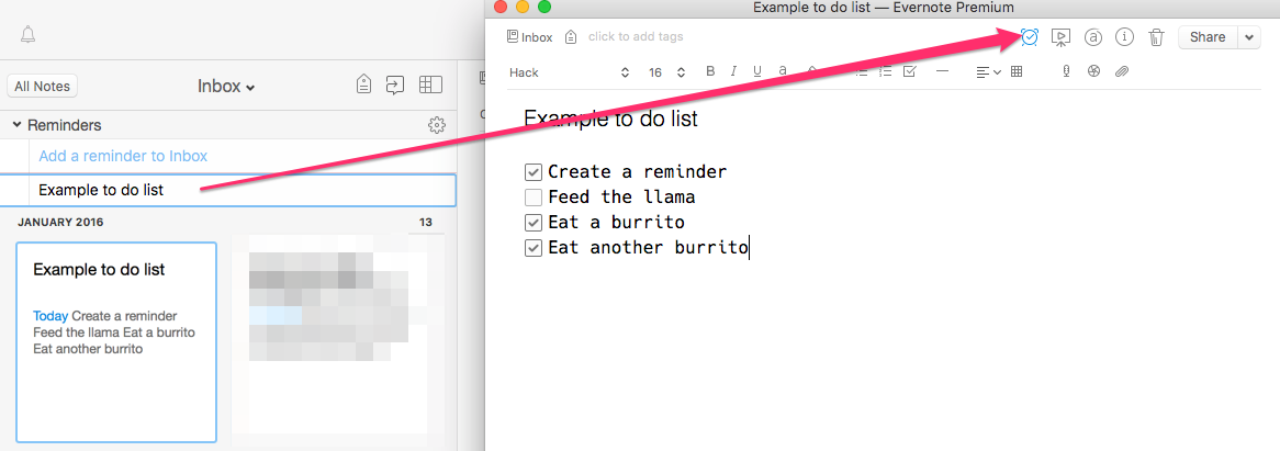
While I love Evernote for all things note-taking, I have the same complaints with it, as I do with Microsoft OneNote. The app is great for note management, but it is not great as to do list app. You have to navigate through the notes interface to even find your note that contains your list, and then you have to jump through a few small hoops to edit/create a list.
Evernote comes with a Reminder feature, but I do not like that, either. You can mark an entire note as a Reminder, and set a date/time to be reminded and while that may be good as a one-off, it’s not ideal for list-making and managing.
TeuxDeux
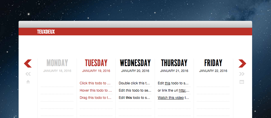
What TeuxDeux (“to do”) does really well is capacity-planning. The whole point of TeuxDeux is to see each of your days in a week, and what you’ve scheduled to do each day. Shifting between days and prioritizing is a breeze.
My main complaints with TeuxDeux is task details. There isn’t a way to add much detail to a specific task with the limited space you get in the UI. That’s great for keeping things simple, short, to the point, but sometimes I need those details, and it’s not possible. I wouldn’t change TeuxDeux because of that as I think the app has a clear purpose and paradigm that doesn’t work for me, however. I want it to, but it doesn’t.
Todoist
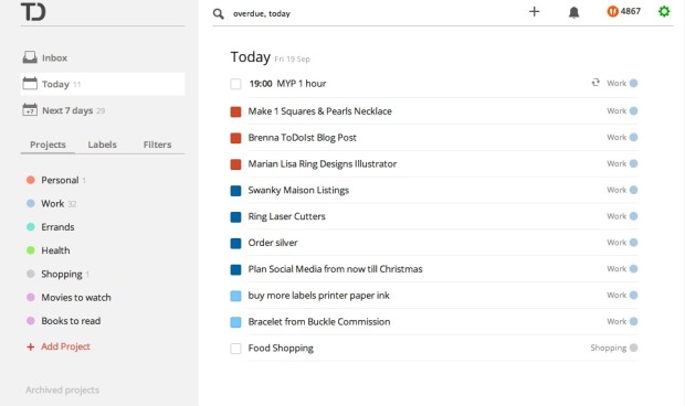
Todoist is another go-to app I try when I think Things is not working for me at the moment. The app is full-featured, and contains features I wish Things had, like hierarchical tasks, comment list, etc. I recently ended a 9-month stint using Todoist to go back to Things, and this is what sparked this whole blog post. The problem I have is that I don’t really have any major complaints with Todoist, but I prefer the Things UI and the majority of their shortcuts. The flow is pretty similar between the two apps, but since I started with Things so long ago, I pine for its behavior, even with its flaws.
Wunderlist
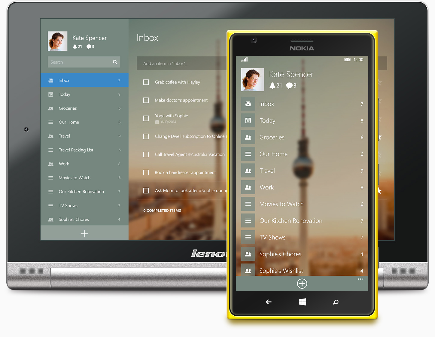
Wunderlist is a great, full-featured to do app that I try for long periods of time, but then give up and go back to Things. I don’t know what I find “wrong” with Wunderlist, as it has a lot of features that I wish Things had, but something about the flow, and perhaps the shortcuts, are not Things-like, and that is why I abandon it. The team behind Wunderlist is constantly updating the app, and adding new features across all platforms, which is awesome and is one of the reasons I fire the app back up every now and again to give it a go. But after a few weeks/months, I feel the pull back to Things, and abandon Wunderlist.
Clear
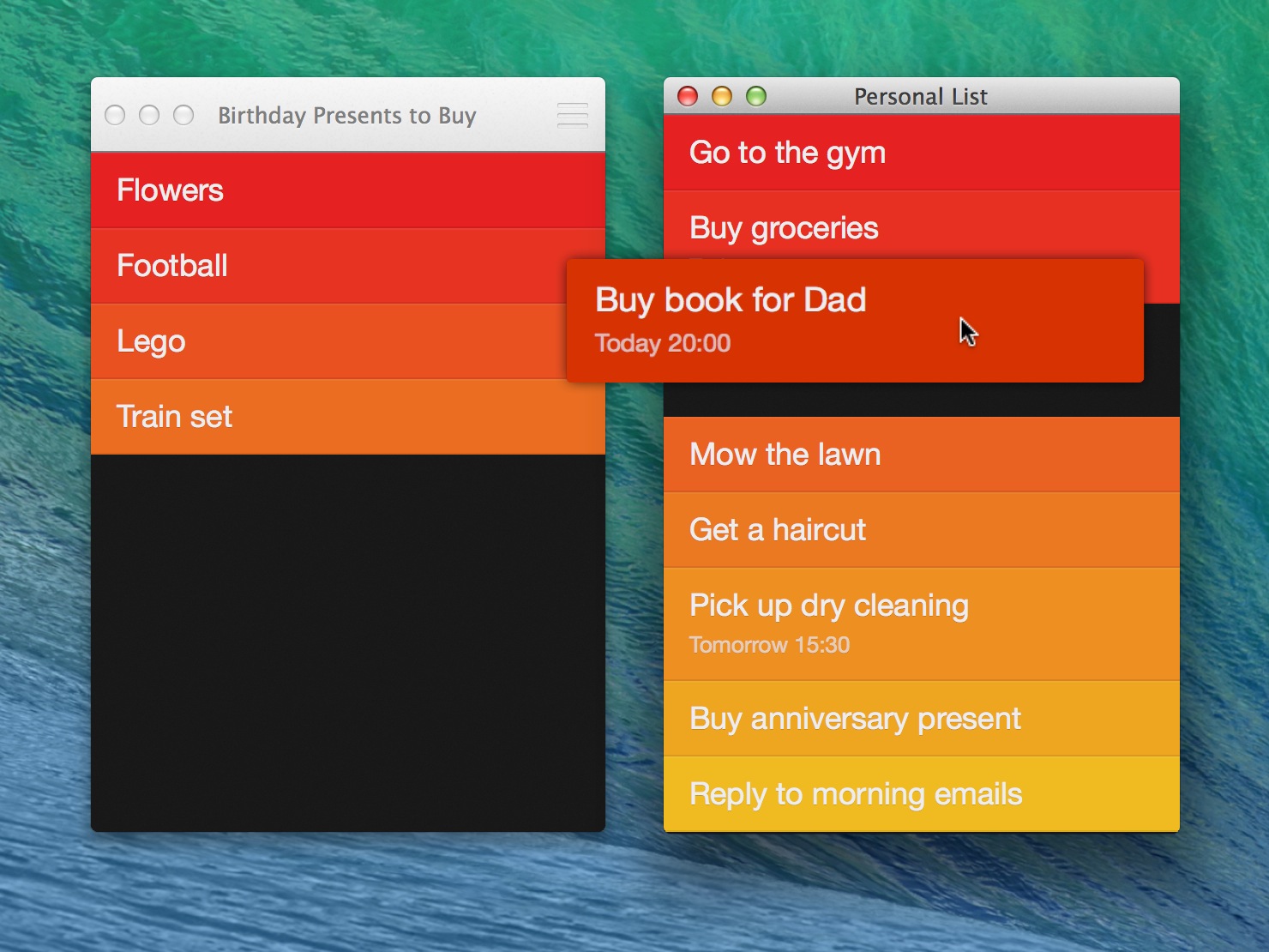
I love Clear. It’s simple, the swipes are intuitive, the visuals are delightful, and you can manage multiple lists/projects. But, for my needs, it’s too simple. It has one way of organizing lists, and if it works for you, it really works. Every few months I try it out again to see if I can switch, but I’ve not been able to for more than a few days. I would need the ability to add more detail per task than what Clear offers at this time. But, that change would break it’s beautiful and terse UI, however. I don’t think it’s worth the trade off. It’s me, not you, Clear.
Things Wish list
Things v3 is coming out soon-ish (maybe in 2016?), and I don’t know a single new feature that is inbound, but I’m hopeful for a few changes noted below.
Swiping!
Things was created before swiping became popular as a way to perform quick-actions on mobile. I would love it if the next version of Things on desktop and mobile had swipe abilities.
- Swipe right to mark as complete
- Swipe far right to cancel
- Swipe left to push task to tomorrow
- Swipe far left to push task to specific date (or move to ‘Someday’)
Comments / Note list
While Things offers the ability to add notes to a single task, it is a single textbox. To add running notes to an task, means you have to come up with your own mechanism for this. I like adding notes as I go along, and having a timestamp of each note is helpful to me, so I add my own notes to each task, and add newlines underneath to look like a timeline. This works, but I’d prefer it if I could add notes or comments as separate items attached to a task, like Todoist and Wunderlist.
Hierarchical tasks or in-place projects
A lot of work that I do is multi-stepped. And sometimes creating a new project in Things is “heavier” than I would like.
- Create the project, give it a name
- (optional) Place it in an area of responsibility
- (optional) Add due date information
- Show in “Today” view
- Add tasks
What I’d rather do is be looking at a list of tasks, either in the Today view, or wherever I’m at, and then create a new task, and then add sub-tasks underneath it. If I were to complete the top-most task, it would mark all sub-tasks as completed, or, perhaps mark any unchecked tasks underneath as “canceled”.
Less tapping on mobile
Getting around on the mobile app is much more cumbersome than the desktop application. You have to “tap into” so many menus and sub-screens, it makes the whole process cumbersome.
For example, to edit a due date and move something to tomorrow:
- Tap a task
- Tap “Don’t show in Today”
- Tap edit
- Tap the date
- Select a date
- Tap save
- Tap done
- Tap the “back” button (top left)
Getting to your project list to see tasks therein is an equally frustrating ordeal. It is not smooth to go from one list (Today) to a project list. It will take about three taps, and sub-second waits for swipe animations, but trust me, after a while it feels quite laggy when you want to do a quick add or review.
What’s your favorite? Why?
I’d love to hear about what to do app you love, and why. Perhaps I’ve overlooked a killer feature in an app listed above? Perhaps I’ve missed a killer to do app that I really must try. Let me know by sending me a link.

